Drag & Drop Line Chart Demo
Interactive line chart demo allows you to drag & drop projected data points to better visualize data.
When you’re working in something like Excel, you update the data and the chart redraws, displaying the new data visually. But, the whole point of visually representing the data is because its raw format is so hard to understand. So why edit data and THEN try and visualize it? Wouldn’t it make more sense to just edit the visual representation of the data and THEN display the new (ugly) data? We thought so. So we did a little code experiment with FusionCharts to do just that.
About the Demo
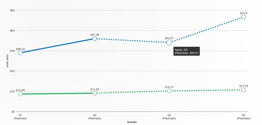
In the demo, we’re using fake quarterly sales data for two companies.
We’re pretending Q1 and Q2 data is “realized” (already happened) so those datapoints are not draggable. Q3 and Q4 are projected (haven’t happened yet) so those datapoints ARE draggable.
Drag one or several of those datapoints and a table below the interactive chart displays what changed and to what it changed. That demonstrates how data from the chart can be read and written–perhaps to a database, or displayed in a table (like this), or downloadable as a CVS (to be put back into Excel or whatever).
About FusionCharts

The Javascript library we’re using is called FusionCharts. It’s mobile-friendly, device-independant, has no dependencies, and works in a variety of frameworks (including jQuery, .NET, PHP, and more).
There’s a free trial version which offers all the features and functionality of the paid version, but has a watermark. The paid version starts at only around $200 per year.

- FusionCharts: https://www.fusioncharts.com/
- Documentation: https://www.fusioncharts.com/dev/
- Free Trial Download: https://www.fusioncharts.com/download/

Justin Downey
Justin Downey is Founder and President of JDM Digital. He's a closet nerd, loves craft beer, and is a poor (but improving) golfer.
Get the Email
Join 1000+ other subscribers. Only 1 digest email per month. We'll never share your address. Unsubscribe anytime. It won't hurt our feelings (much).