Design Mistakes that can Ruin Your Content
Everyone makes design mistakes, but when it happens, you gotta fix it. Immediately.

Some simple design mistakes will ruin your content, or cause users to abandon your site, or worse, lose trust in the information you provide altogether.
It’s often tough to know what exactly has gone wrong. Here are 7 design mistakes to look out for and a few ways to fix them.
1. Sloppy Typography
The biggest typography mistake people make is about space. Line spacing, or leading, letter spacing, or leading, and font size. Often designers look out for poor font choices and neglect these more important typography decisions.
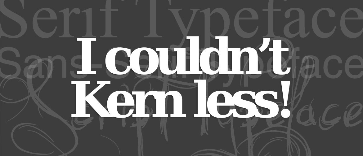
When you don’t respect space in your typography, the design feels cluttered and difficult to read.
2. Sizing Monotony
We’re all for consistency, but there’s a limit. All the text is the same size. All the buttons are the same size. It all ends up to the kind of monotony that’s just plain boring.
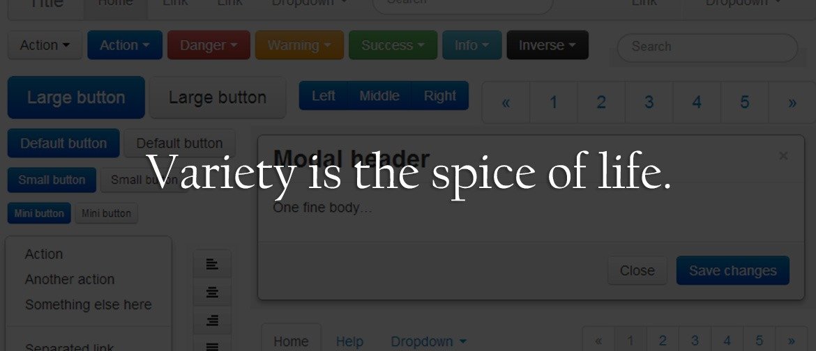
Mix it up with a couple of size and scale options for each type element. You can still stay consistent, even as you vary between different element types.
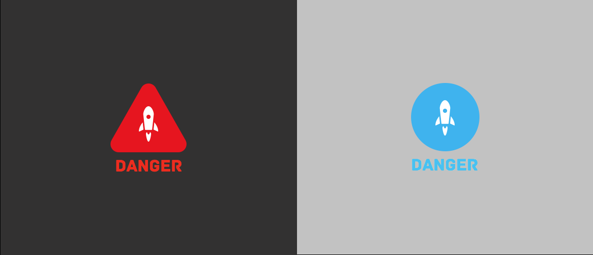
3. Lack of Hierarchy
It’s not the easiest concept to master, but a distinct hierarchy of elements helps lead your users to their desired action.
As a rule of thumb, the biggest things in the design should be the most important. Scale down items of lesser importance. Rank and group information so its scannable and easy to read at a glance. Then, turn that hierarchy into a set of rules for consistency’s sake.
Get it right, and the whole site will be far easier for your users to engage with.
4. Ignore Conventions
Ever click a link and nothing happened? Or looked for the contact page only not to find one?
Take care not to ignore design conventions. Be creative, by all means, but don’t let it take you too far away from the basics.
5. Too Wordy
The problem with many websites is that they use way too much copy to explain simple things. Maybe they think it’s good for SEO or something, but it’s just annoying to users (and to Google, by the way).
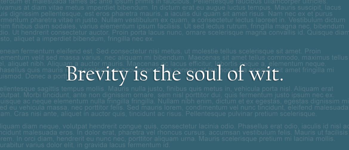
Edit your copy. Set it aside for a while. Edit it again. Use a screen reader to read your copy to you so you can listen for any awkward phrases.
Clarity in writing helps users stay interested and moving through your site.
6. Overdone Design
Using too many photos and drop shadows, or dancing icons, or painfully-stock photos won’t make your design stand apart. It makes it look like any other poorly-designed site among millions.
Use design tricks sparingly.
7. Don’t Give Up
Don’t get discouraged if you are guilty of committing one or several of these design mistakes. It happens to us all. Don’t give up and don’t be afraid of throwing work away.

In time, you may look back and be glad you started over.

Jenee Echard
My 3-year-old is a smartass, just like me. I’m a sucker for banjos, harmonicas and ukuleles. I am painfully shy, so I can come off as snobby. I love my work. I enjoy being challenged.
Get the Email
Join 1000+ other subscribers. Only 1 digest email per month. We'll never share your address. Unsubscribe anytime. It won't hurt our feelings (much).